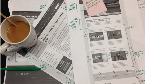
Just minutes ago I completed a very long and tedious heuristic evaluation. Several weeks in hibernation, a couple dozen cups of coffee and more than a few headache powders later and I'm all done. Earlier this evening I actually threw my hands in the air as if I had crossed some imaginary marathon finish line. Nope, not kidding, I really did. Right there at my desk for all to see. Sometimes you've just gotta celebrate.
Recently, a client asked us to help them review their current digital collateral. They needed assistance working through a brand update and website redesign. The project was to include UX evaluations, brand inventories, competitive analysis, site architecture, the whole nine yards. Just my kinda gig. However I realized once I began prepping for the evaluation that I hadn't updated my processes and documentation in a while and I wasn't fully satisfied with them after their last use. So, I was faced with the evergreen question of recycle, refine or retool. After much hand-ringing and more than a few dozen glances at the timeline and milestone documents, I bit the bullet and decided to retool. It was time for a new approach, new processes and while I was at it I might as well see if another format afforded better outcome.
In the past I've used Word documents, Fireworks files, PowerPoint, Excel spreadsheets and other software mash-ups to perform and document my heuristic evaluations. All of them have their place, but each has shown some major drawbacks. I've struggled with retaining control of formatting, operating system tug-o-wars and version control. This time I was looking for something different. I wanted something scalable, something I could easy edit remotely and most importantly it had to be easy for other team members to access and contribute. So, I decided to go with Google docs. And so far, I've been more than pleased with my decision.
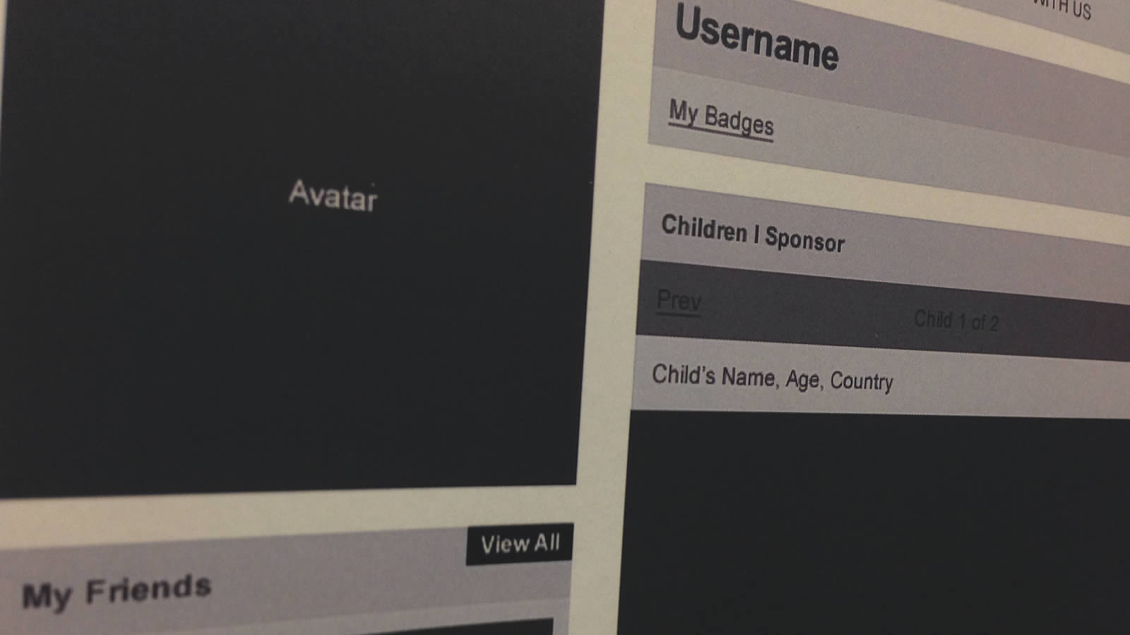
First thing I had to do was port over all my heuristics into the new format. Quite frankly, I thought this might be the worst task I'd taken on in a while. I've died the death of a thousand spreadsheet cells in the past, and as I'm sure you're aware, it's a torture like no other. Surprisingly, once I jumped in and begin nudging those columns and color coding the rows, it came together quite nicely, thank you. As a matter of fact I think Google's minimal design esthetic and my penchant for removing cruft work well together. Here's a screen grab of one of the sections.
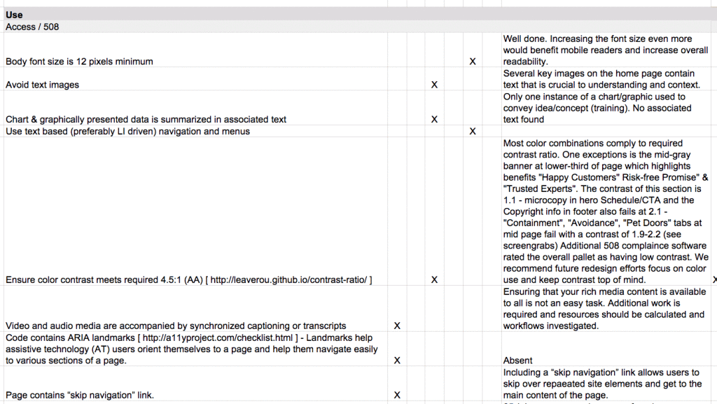
Screengrab of evaluation
I'm happy to report that we shared the first draft of the audit with the client earlier this week and it was a huge hit. I credit the simple layout and the document's high level of readability (even as a screen grab) for the warm welcome the presentation received.
Now the next test comes into play. I'll route the document this week internally for final contributions from other team members and for the all important proofing stage. Usually my heuristic reports route as flat copies for old school style redlining (for those not in the agency world, that means someone actually taken a red pen to mark up my spelling and grammatical gaffs). I'm guessing that being able to edit the document directly is gonna be a big hit. Fingers officially crossed.
I'll post updates as the project continues. And in the spirit of sharing, if we decide to adopt this process, I'll explore the idea of providing access to a google doc template of the evaluation so those of you searching for a new form of documentation can give it a test drive for your next project. So, stay tuned.