CLIENT: Tractor Supply Co.
ROLE: Creative Director, Product Manager
YEAR: 2018
PROJECT TYPE: UX, Design System, ECRM
Sending complex emails to seven million loyal customers
Sending complex emails to seven million loyal customers
BRIEF: Tractor Supply Co. came to us with a full-scale ECRM program already in place. And while the infrastructure was solid, they needed help crafting new design processes, architecting a content hierarchy, and establishing a pattern library. Oh, yeah, and they wanted the redesigned product to be fully responsive. Just my kind of gig.
BOTTOM LINE: We made sure their emails look great and deployed in a fraction of the time while boosting delivery rates, opens, and clickthroughs.


Process Overview
Like many projects of this size and scope, we kicked things off with an extensive discovery phase. We followed that up with a content inventory and dozens of wireframe iterations. With over 12 project stakeholders and the inbox experience of 7 million customers to consider, we took every precaution to ensure we were launching the right product and solving the right problems.
The result is a robust front-end framework and pattern library that makes weekly broadcasts a breeze, A/B testing hassle-free, and onboarding new team members a snap.
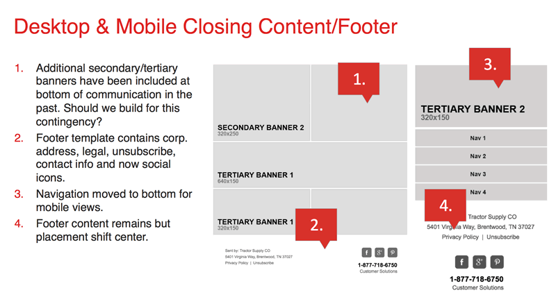
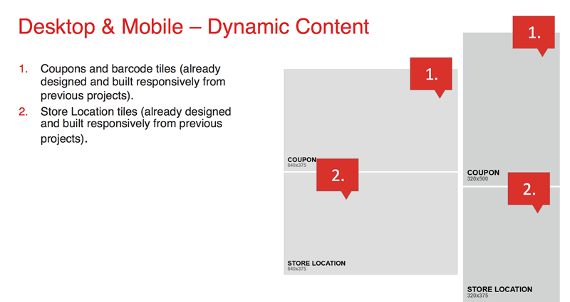
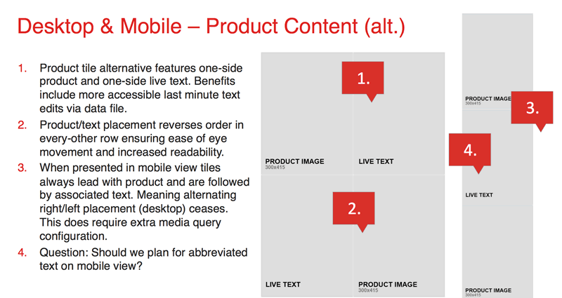
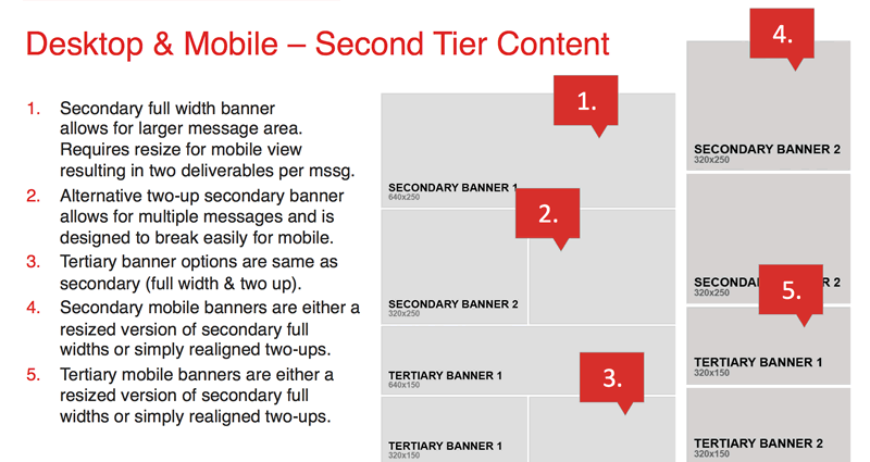
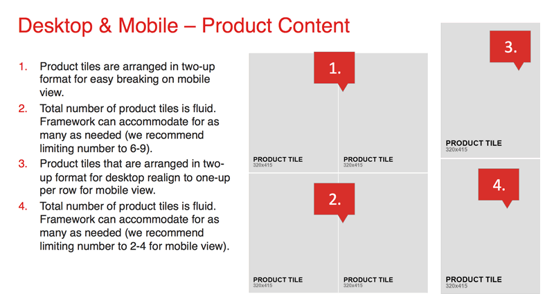
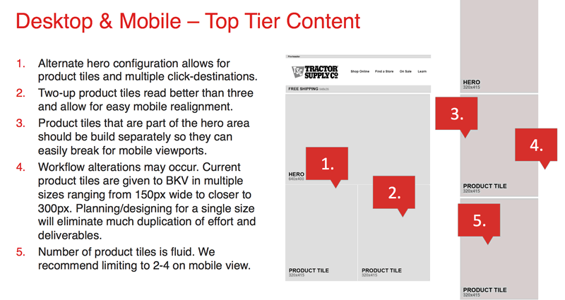
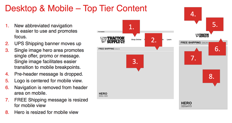
A few examples from one of the many wireframe and content audit presentations.
Artifacts from the design and pattern library phase.
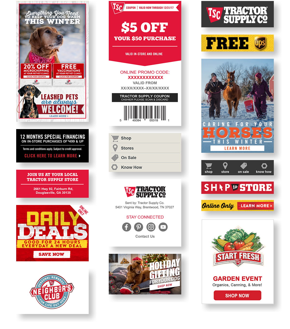
The new design uses a modular layout comprised of dozens of components including dynamically generated coupons and barcodes, allowing the team to design quickly and build with confidence.
Make no mistake, while these emails look great they are no mere show pony. They are designed specifically to communicate promotions and generate sales.


“Nothing is particularly hard if you divide it into small jobs.”
“Nothing is particularly hard if you divide it into small jobs”
–Henry Ford
CREDIT WHERE CREDIT'S DUE.
An official doff of the hat to the team that made this project a raging success.
CREATIVE DIRECTOR: Todd Chambers
PRODUCT DESIGN, UX: Todd Chambers
ART DIRECTOR: Travis McAfee
UI DESIGNER: Andy Mitchell
UX Lead: Todd Chambers
Art Director: Travis McAfee
UI Designer: Andy Mitchell
Copywriter: Zoe Courtman
PROJECT MANAGEMENT: Christina Mangini
ECRM DIRECTOR: Billy McNair
COPYWRITER: Zoe Courtman
PROJECT MANAGEMENT: Christina Mangini
ECRM DIRECTOR: Billy McNair
COPYWRITER: Zoe Courtman
Portfolio of Todd Chambers | Copyright © 2021 | wtoddchambers@gmail.com
Portfolio of W. Todd Chambers | Copyright © 2018
wtoddchambers@gmail.com
