CLIENT: Vanguard Charitable
ROLE: Accessibility Lead, Creative Director, UX Manager, UX Research, Content Strategy
PROJECT DATE: 2020
PROJECT TYPE: Experience Design, Information Architecture, Content Strategy, WCAG Compliance, CMS Platform Migration, Online Branding, and Storytelling
CLIENT: CFGA
ROLE: Creative Director, UX, Product Design
YEAR: 2017
PROJECT TYPE: Website Design, Information Architecture
Creating a Multi-generational Experience for a Philanthropic Powerhouse
Building a new website for Atlanta's favorite do-gooders.
BRIEF: Vanguard Charitable is one of the world’s oldest and most respected financial institutions. They partner with families and individuals to harness philanthropy and direct long-term giving to qualified nonprofits. Their mission is to maximize the impact of generational giving through the use of donor-advised funds.
BOTTOM LINE: During the course of the 20-sprint project, we implemented a new content strategy, designed a new online donor experience, orchestrated a CMS upgrade, built a modular-based UI library, tailored a new tone of voice, and elevated a brand new website, that increased online donations immediately.
The Origin Story
Problem Statement:
Vanguard Charitable is a storied brand bracing for a seismic demographic shift.
In order to maintain market share and achieve growth initiatives, they must transition from serving a traditional (and aging) population of baby-boomer customers and focus instead on a new generation of millennial cause-advocates. A group, by the way, that sees giving very differently.
Solution:
The Moonraft team partnered with Vanguard Charitable to build a donor giving experience that anticipated millennial’s expectations and understanding of philanthropy.
We designed an optimized giving machine that resonated with young customers and was easy to use. We followed through by creating a library of reusable design patterns so the in-house team could carry on our efforts post-launch.
The Scope and Constraints
While expectations for the relaunch were sky high, the budget – and by extension, the team size – was relatively small. The client team assumed the sponsorship, stakeholder, and SME roles, and my team handled the research, design, development, accessibility, QA, and project elevation efforts.
We had 20 sprints to get the job done and deployed a wide array of tools to make cross-discipline collaboration easy. In addition to coffee and chocolate, the team relied on AWS, Deque, InVision, Jira, Optimal Workshop, SiteImprove, and Sketch.
The audience
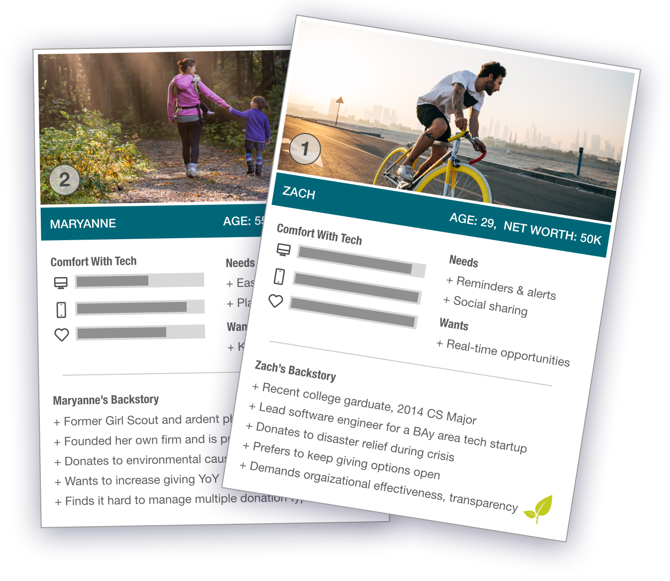
We were speaking to a very diverse group of customers. One that crossed many political, religious, and cultural divides. In the end, financial net worth was one of the few unifying threads. Vanguard Charitable has a minimum investment threshold of $50,000 and a preferable portfolio size 0f 5,000,000.
We settled on two personas. One that represented the old guard and another for the next generation of philanthropists.
Our younger customer, while not as likely to have amassed as much wealth, was often considered more heavily when making design decisions. It was this demographic that would carry the tradition of cause-investing forward.
The Process We Used
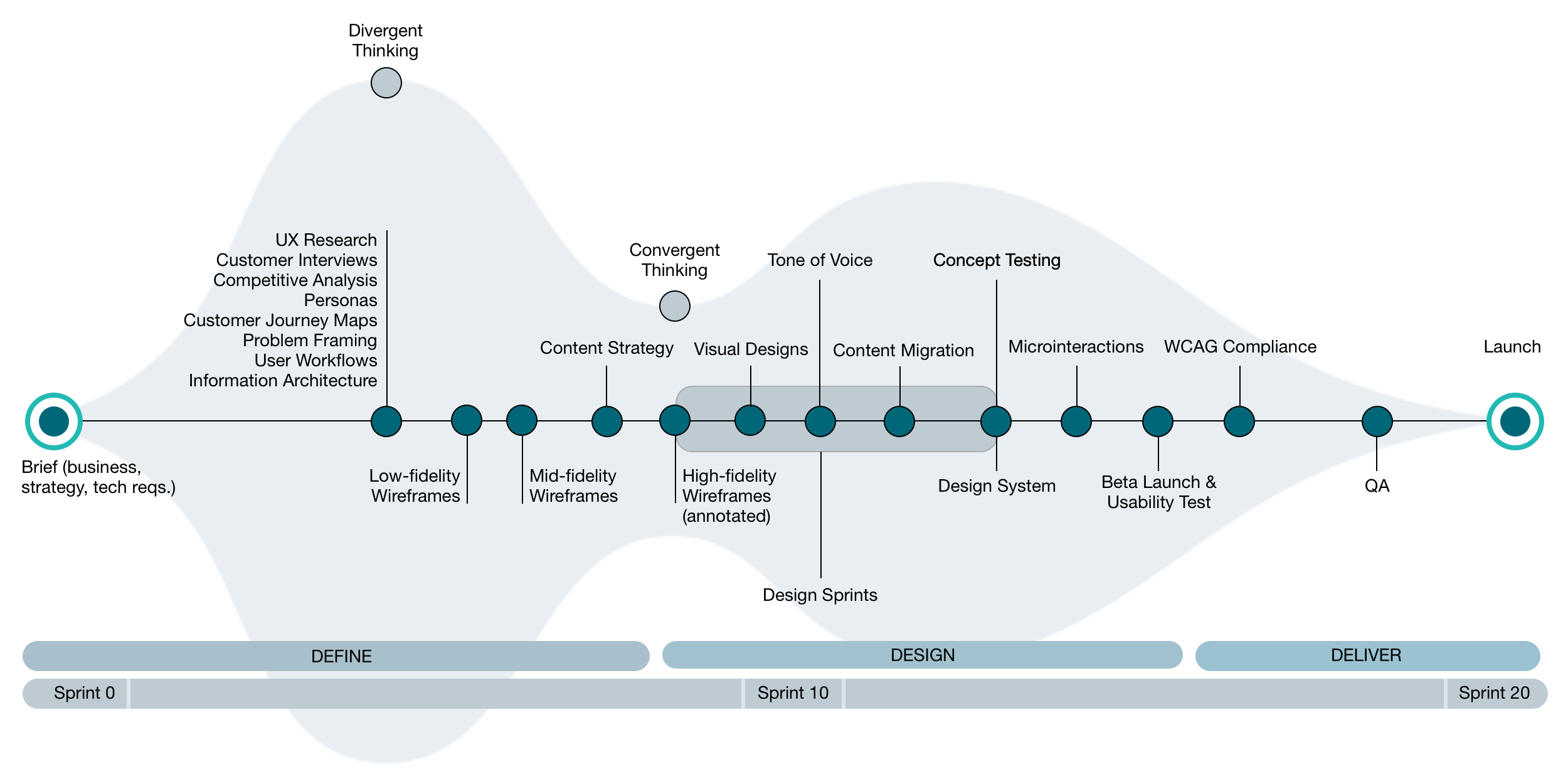
Define
We explored modern giving concepts and identified the motivations, and objections of both personas. We conducted primary and secondary research, mapped customer journeys, and identified emotional drivers behind investment strategies.
To capture the institutional learning of the leadership team and the insights of the subject matter experts, we facilitated design sprints and conducted content and branding workshops.
Design
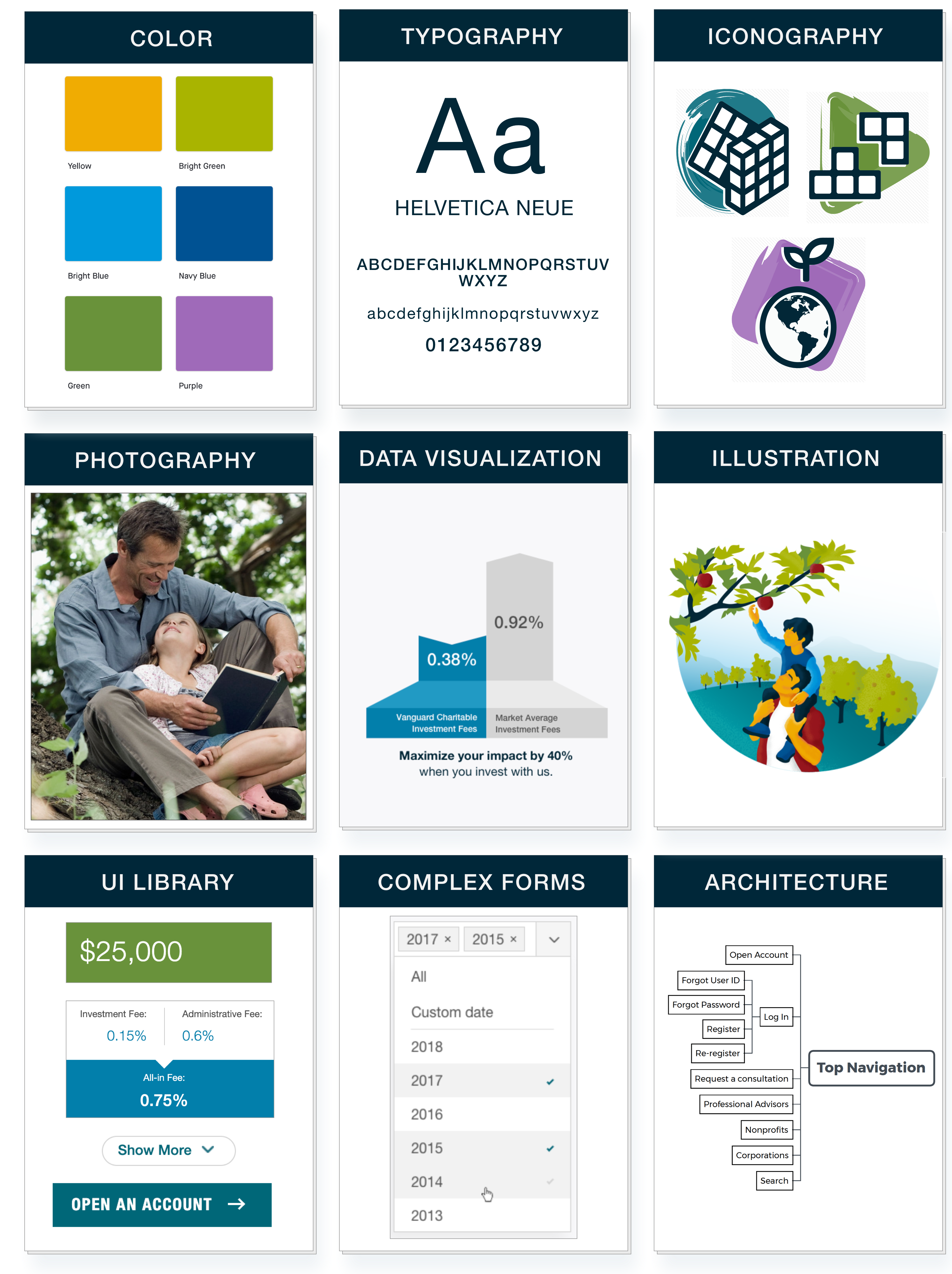
After drafting and testing a new information architecture we delivered hundreds of low-, mid-, and high-fidelity wireframes.
We followed that with pixel-perfect screen mockups in both desktop and mobile views. We collaborated with the engineers and the client content team to design and build a robust, modular design system that covered everything from typography to tone of voice.
Deliver
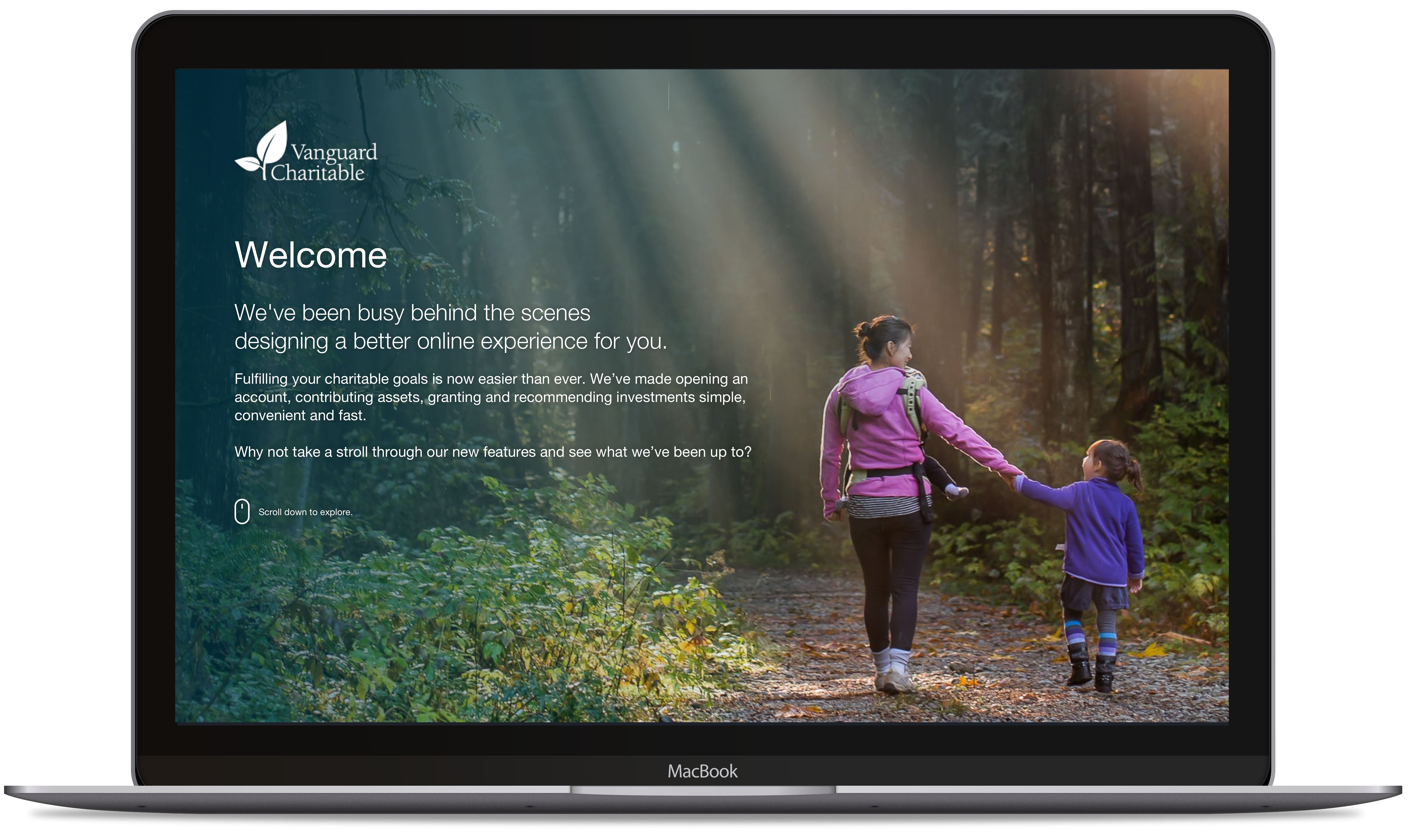
We used an agile process and a 20-sprint roadmap to build and launch a 200+ screen responsive user experience based on HTML5, CSS3, and React. All built on the Drupal 8 framework.
As promised, we delivered a new donor experience just in time for the increased traffic of the 2019 Holiday giving season.
Crafting a New Tone of Voice
The Vanguard Charitable brand has been recognized as an industry leader for over 75 years. And maintaining that brand equity during the redesign process was non-negotiable.
However, it was also imperative that an updated tone of voice be implemented. We were speaking to a new and younger donor and were addressing ideas about philanthropy and approaches to legacy giving that were not previously in play.
How we spoke to the customer–and how that made them feel–became as important to us as the technical and legal information we provided.
The first order of business was to survey key stakeholders to gauge their current understanding of the brand's voice. Not surprisingly, there was a great deal of inconsistency in how the voice was being used.
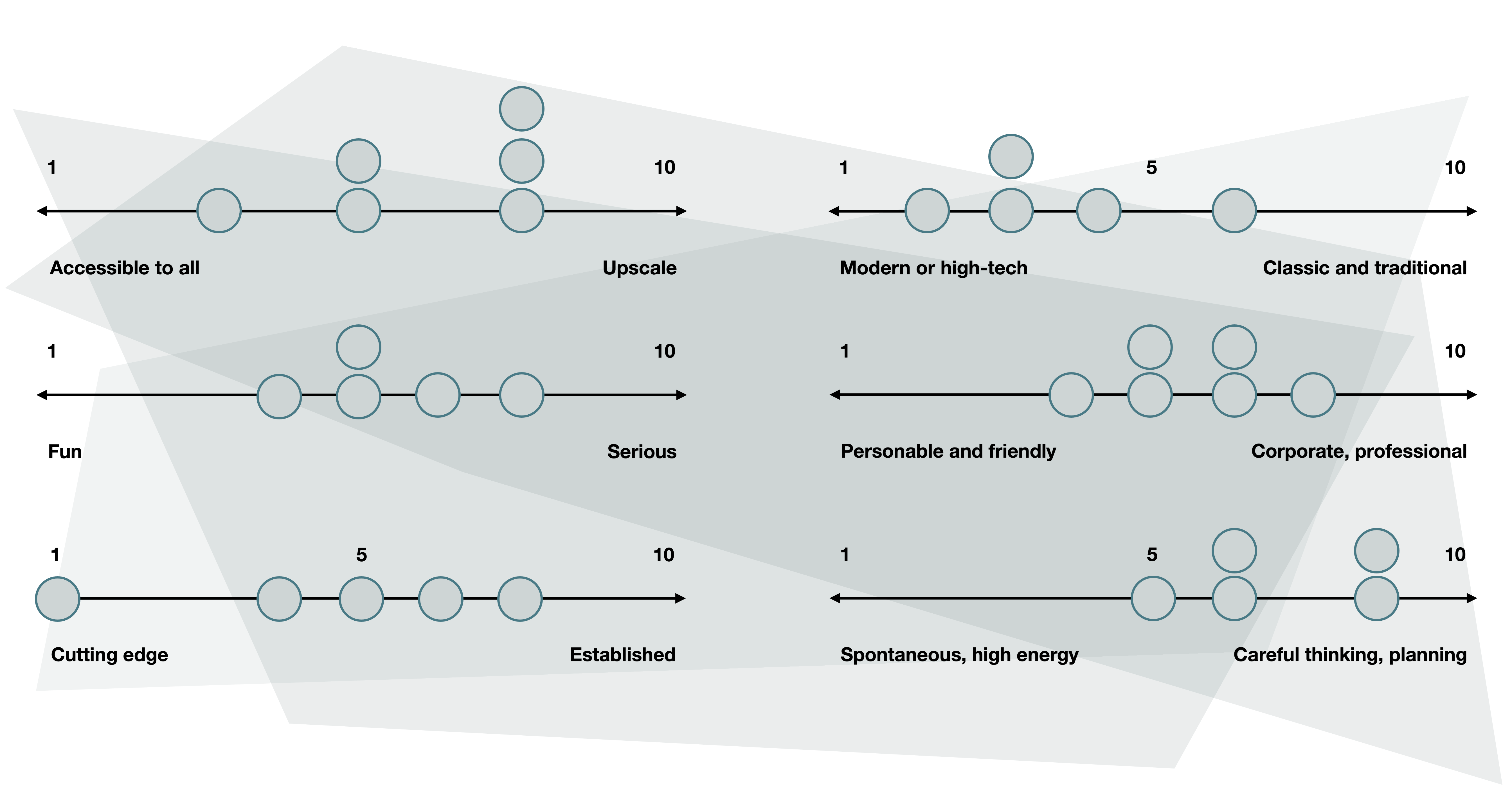
This series of graphs shows the leadership misalignment on brand and positioning hierarchy.
A New Playbook Was Created
We knew that our customers wanted to use their wealth to support the causes they care about. We also understood that investing and granting wisely is complicated, time-consuming, and stressful. Prioritizing the way we spoke to people was one of the most immediate ways to remove the worry and confusion surrounding donor-advised funds and empower them to make the world a better place.
We created the following six principles to act as navigation waypoints. Each checkpoint reminds us of the critical role language plays in building customer relationships.
1. We Speak in the First Person
Doing so allows us to own our words, it ensures authenticity and anchors the conversation in the present. It’s also the only way to build relationships.
2. We Use a Conversaional Voice
We speak to people in the same way we like to be spoken to. it takes skill and intention to approach transactional conversations with a human touch.
3. We Are Translators
Only expert guides can make what’s difficult look easy. We demystify donor-advised funds so that you can stay connected to your wealth and make a bigger difference.
4. We Are Plainspoken
Our customers live in a world muddled by hyperbole and up-sells. We strip that away and use only simple words and sentences. We educate without dumbing down. We clarify and never confuse.
5. We Are Friendly
We write like a human. Using emotive language we build relationships, break down barriers, and relieve stress. We are laser-focused on helping donors but are careful not to take ourselves too seriously.
6. We Adjust Our Tone as Needed
If our readers have just completed a complex donation, congratulate them. If they're confused about the next steps, cut the cruft and offer a solution. People are dynamic, our writing should be too.
Designed for Accessibility
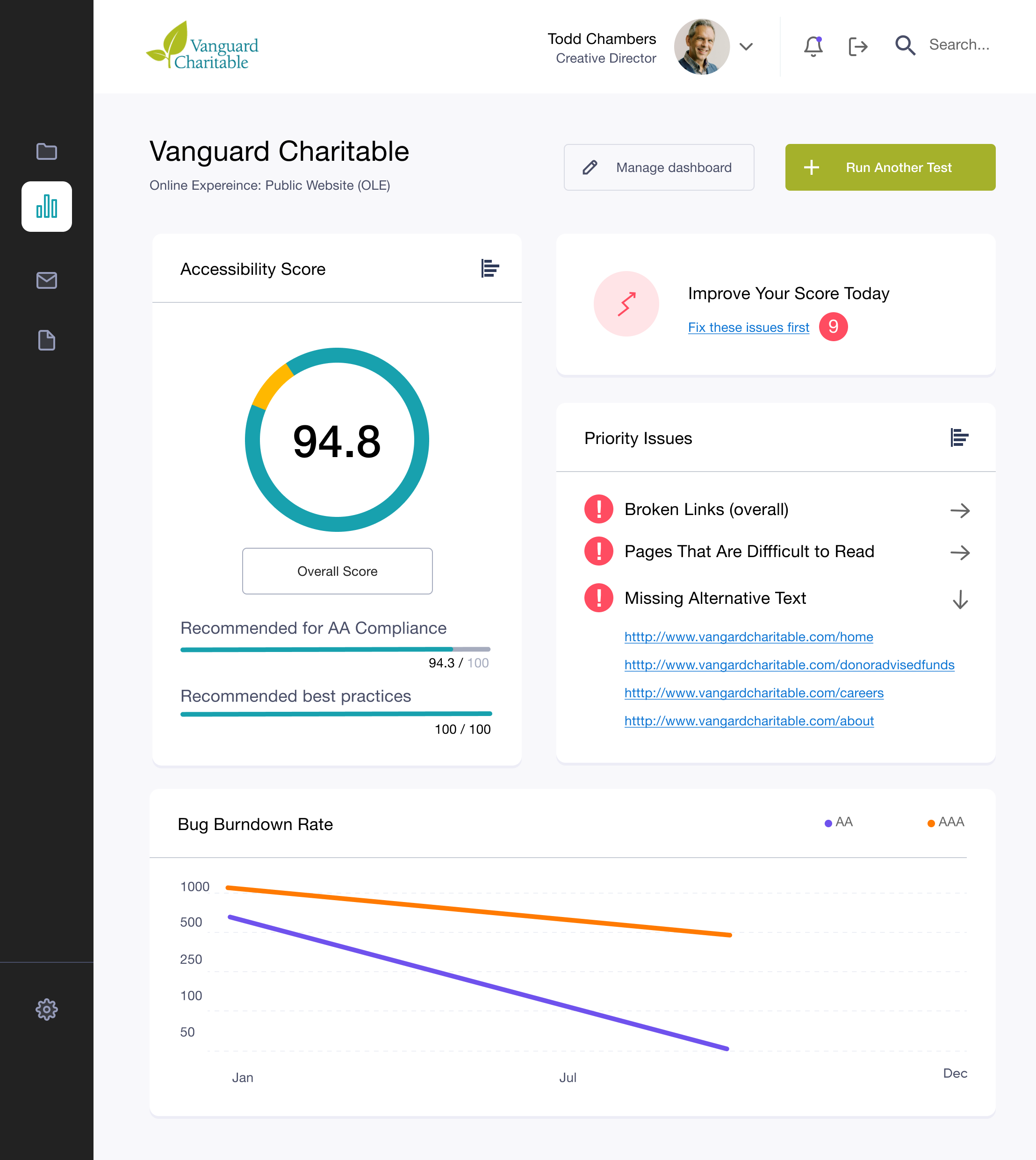
One of the most rewarding aspects of this project was meeting the strict requirements of WCAG 2.0 AA compliance.
Vanguard Charitable believes in the power of inclusion. It's a part of their ethos. And they knew that creating an online experience that all customers could access equally was no small order.
Our goal was not only to achieve a high overall site score when tested by automated engines but to retain that level of access once manual testing and the rigorous QA process began.
The Proof is in the Pudding
Tens of thousands of lines of code were reviewed and remediated to elevate the website to an all-time high accessibility score of 94.8 out of 100. New vendors were sources, tools were implemented and standards established to govern a post-launch accessibility maintenance program.
The Project Outcomes
In October 2019 we launched the beta version of the newly designed donor experience to a select number of premium Philanthropists. One month later, we then threw open the doors to the general public. The unveiling was a huge success by all measures. Online donations increased immediately, new users were served faster, and internal workflows were freed from previous bottlenecks.
A small list of big changes:
Increased Conversions
Actionable dashboards and intuitive interfaces drove higher contributions and generated an 85% YoY improvement in online donations for Q4 2019.
Enhanced User Experience
Thoughtful user journeys, new site architecture, and a fresh visual language led to quick adoption, higher donor engagement, and increased shareability.
Designed for Inclusivity
Priority was placed on generating content that promoted diversity and highlighted the client’s longstanding dedication to workplace inclusivity.
New Design System
We used Invision DSM to build a comprehensive pattern library. It provides easy access and scalable reuse of content delivery modules and creative assets.
Simplified Onboarding
Easier sign-up, sign-in, and get started workflows ensure that product adoption is quick and easy.
Data-driven learning
The integration of Google Analytics allows for continuous improvements based on real-time data.
Lessons Learned
It would be easy to put this one in the win column and move on. The product is live, performing well, and the client remains pleased was with the results. And yes, we celebrated. But I believe that smart teams always learn from their experiences. Both the wins and the losses.
Here are my two key takeaways from the project:
1. An Unexpected Surprise
Great teams turn decentralized workflows into a blessing.
When everyone is focused on a shared vision and is dedicated to the success of the team, geographic and cultural differences become powerful assets. Timezones can be force multipliers and remote working can catapult productivity. Mindset is everthing.
2. What I'd Do Differently
Designing for accessibility is not complicated but it is complex. To be done correctly and with minimal impact on scope and budget, the process must be considered from Sprint-zero. Next time, I'll insist that disabled persons are part of our research and will add accessibility annotations into all early deliverables.
"Change is the law of life. And those who look only to the past or present are certain to miss the future."
–John F. Kennedy
CHARTING THE COURSE. The dedicated crew that brought this bold vission to life:
CREATIVE DIRECTOR, UX MANAGER: Todd Chambers
ACCESSIBILITY LEAD: Todd Chambers
UX LEAD: Arjav Shah
LEAD DEVELOPER: Gopinath Manimayan
CREATIVE DIRECTOR: Todd Chambers
ART DIRECTOR: Joshua McKnight
FRONT-END DEVELOPER: Nathan Skinner
DESIGN/DEV PRODUCTION: Moonraft Studio, Bangalore
PROGRAM MANAGER: Hari Prasad
UX RESEARCH: Uzair Ahmed, Todd Chambers
CLIENT LEAD/SPONSOR: Linda Kaiser
CO-CREATIVE DIRECTOR: Michelle Gunn
DEVELOPER: Matt Hurst, David Briggs
DIRECTOR (video): Scott Johnson
Portfolio of Todd Chambers | Copyright © 2021 | wtoddchambers@gmail.com
Portfolio of W. Todd Chambers | Copyright © 2018
wtoddchambers@gmail.com