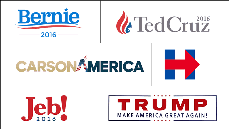
It's August 2015 and (with the exception of Joe Biden) all the major candidates have officially thrown their hats in the ring. We're starting to hear the early drafts of their stump speeches, debates are scheduled and the candidates' logos and websites are being developed and fine tuned. So in the same spirit of launching, this post will act as the kickoff to my following of the unfolding story of our presidential hopefuls and their digital efforts in the race to win the hearts and minds of America. I'll check back in every month or so and comment on the stuff that really matters; logos, brand positions, tone of voice, website design and their use of advertising.
Let's start with the logos
A logo is often the first impression the public has with a candidate's messaging and you can typically tell a lot about a brand (and candidate) by the logo. Font choice, color pallets, inclusion of iconography, formatting and the use of metaphor and historical references all play a critical role in the impression left with the viewer. So far it looks like Bernie Sanders and Jeb Bush get the nod for the friendliest logos. Both are using neighborly fonts and have decided to play it safe and steered clear of tag lines. Bernie's lighter blue does have a particular youthful feel. I'm a bit puzzled by Hillary Clinton's logo. It certainly take the top spot for simplicity and I can appreciate that, but I'm sure I'm not the only one whose noticed that the arrow is pointing right [>].
Donald Trump and Ben Carson both have strong logos. They are anchored by block style fonts and leverage the familiar all-capital lettering that demands attention. No doubt these will stand out from a distance. I question the flag/A mark in the middle of the Carson logo though as it seems to add more visual confusion to the mark than is necessary.
And finally, Ted Cruz. I believe Cruz has one of the best logos of the current candidate pool. It's sophisticated, reads quickly, is strong without being stuffy and the flag/flame icon is both exciting and winsome.
How about you? Any of the candidates' logos standing out as a sure winner? If you had to pick a leader by their brand mark who would you choose?
My guess is we'll see some further refinements made to these logos in the coming months. We're still several months away from the heart of the campaign season and the tide will undoubtedly turn for some of the frontrunners. Other names will likely rise to the top and brilliant campaign managers will begin tinkering around the edges of both the personas and the marketing collateral of their candidates. It'll be fun to watch.
Next ...
As we continue to narrow the field I'll begin looking at each of the players' website designs. Particularly, I'll treat them like a new business prospect and audit the sites for usability and accessibility best practices. I'll comment on design, copy, information architecture and even make recommendations on conversion optimization opportunities. Stay tuned.


No comments.